Showing posts with label typography. Show all posts

Friday, May 24, 2013

 Sexual abuse - a film about contacting Childline
 A really beautifully executed typographical animation for Childline.


Tuesday, August 10, 2010

new wave editorial 'machinist'
shot by kate friend.


Thursday, August 5, 2010

pilot : extra fine

Wednesday, August 4, 2010

anchor butter : made by cows
chi commissioned illustrator paul Slater and hand lettering artist alison carmichael to work with designers dan beckett and suzie hydon to create the ads - which all hark back to a time when advertising slogans were painted direct onto the walls of buildings in towns and cities. the idea is that this old style helps reinforce the fact that the anchor has been producing butter since 1886 - which was the golden age of hand painted wall mural advertising.

Thursday, June 24, 2010

pilot hand writing
write by hand on your computer! go to www.pilothandwriting.com, turn your handwriting into a digital font and send handwritten e-mails to your friends.

Monday, October 12, 2009

fail harder
what a beautiful piece of work at w&k portland, created by wieden & kennedy 12. over 100,000 thumb nails were used and it took over 351 hours, but it just goes to show if you try hard enough, and keep going, you can make something exceptional.

Tuesday, September 22, 2009

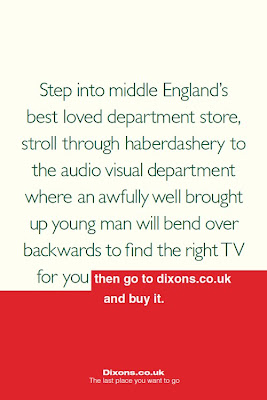
dixons : the last place you want to go
m&c saatchi, london, have created an unusual, and honest print campaign cheekily acknowledging the consumers pattern in shopping (we will get advice about expensive goods at a more upmarket store, but then nip online to make the actual purchase, where it is alot cheaper). using familiar fonts from a number of popular london retailers – selfridges & john lewis shown here, the ads open with a description of the benefits of shopping in these stores, before then reverting to the dixons font with the line "then go to dixons.co.uk to buy it". the self-harm/awareness continues with the ads' tagline, which is "the last place you want to go". i wonder how long it will take for selfreidges, john lewis, harrods and the rest to reply to these ads? my moneys on selfridges.

Thursday, September 3, 2009

f is for fail; a alphabetical odyssey, by brent barson
i came across this and it is absolutely stunning, a perfect of example of beautiful moving typography. more of his work can be found here and other similar work from the students at byu.

F is for FAIL from Brent Barson on Vimeo.

Tuesday, September 1, 2009

tattooday
tattoo day is the daily typographic project by thomas brodhal, one of the creators of surfstation. like a temporary tattoo, each day he hand-lettered a quotation or song extract on his arm.

Friday, July 24, 2009

a typographic map of paris
after 6 months of research & a 7 day trip to paris, mark webber has spent the past 2 months carving an enormous linocut, typographic map of Paris. can't wait to see it when it is finshed!

Monday, June 22, 2009

unofficial music video for death cab for cutie by ross ching
very pretty typographical mmusic video, done by meshing together alot of photos and making them move.

Death Cab for Cutie - Little Bribes from Ross Ching on Vimeo.

Monday, May 18, 2009

Friday, April 17, 2009

pistilli
im loving the new pistilli font by veer. its so nice.

Thursday, April 16, 2009

hand made fonts
this website is great for finding lovely unique,
untraditional hand made type, more can be found
here

Wednesday, April 15, 2009

beautiful hand made typography by Julene

Friday, April 10, 2009

stihl
a really lovely example of a beautiful and effective typographic ad done by winsper in boston

Wednesday, April 1, 2009

london 2012 olympics typeface
according to the creative review blog today, the typeface for the london 2012 olympics is being announced today, and rumour has it that they have chosen 'comics sans'.... april fools????? i hope so!